

Where (Dashboard)
"Where" is a product that enables healthcare professionals to track the location and status of medical equipment using tags and sensors. The dashboard provides actionable insights and key analysis around inventory management.
PLATFORM: Web
TEAM: 1 Designer, 1 Product Manager, 2 Front-End UI Developers, 2 Backend Engineers, 2 QA Engineers
ROLE: Design Lead
I was responsible for the overall design & its process. I interfaced with the cross-functional stakeholders and presented the key deliverables.


RESEARCH
I identified and documented comparable products with the goal to evaluate their dashboards. However, I discovered none of these products featured a dashboard. So I decided to research Real-Time Location System (RTLS) solutions outside of healthcare as it was a similar use-case of tracking inventory. In particular, found examples in fleet tracking and industrial tracking

Excelsheet with other similiar product listing


RTLS Dashboards
In addition to the above research, also did research on the healthcare inventory management and its pain points. See the below image for some key pain point findings.
HEALTHCARE PAIN POINTS
25% of a hospital’s wheelchair fleet is reported stolen or lost every year
- Post Gazette
Around 5000 people die due to infections picked up from hospitals each year
- Daily Mail
30% of nurses on average report spending at least one hour per shift searching for equipment
- Nursing Times
Costs for lost wages from time spent looking for assets amounted to 4,000 USD every day
- Northern Illinois
From 2010-2014, 383 items valued at more than 11 million USD were missing
- Santa Clara Valley Medical Center
10-20% of hospital inventory gets misplaced every year
- Gartner studies
Next step was to brainstorm who the users would be, their situations and motivations

Whiteboarding
After whiteboarding and making assumptions, it was important to talk to potential users. The goal of user conversations was to learn about their needs and requirements so that we can create a dashboard representation that would be most relevant. After formulating the questions and reviewing them with the Product Manager, I conducted 10 user interviews.
Questions asked in User Interviews:

WHO
-
Who will be the primary user(s) of the dashboard?
-
Who all should be able to access it?
-
Would you need identity and access controls to certain widgets in the dashboard based on the user role?
-
What information would be the most important?
-
What actions do you want to drive out of seeing the dashboard?
-
What are the most common categories for the inventory of assets?
-
Has there ever been a need to look for assets across a floor (e.g., which floor has the most wheelchairs in building X)? Why? Would a comparison of asset counts across floors have been helpful?
-
Have you ever tried to understand consumption of assets over time? Would that be useful to know and if you had that information and how would you use it?
-
What are the most common status of devices/assets you have? What status (e.g., low battery, needs repair, needs sanitization) do you commonly look for today? Any status you wish you could view but aren’t able to today? Are there certain status combinations that would be valuable to view together (e.g., low battery and needs repair)?
-
Have you ever needed any time sentivitive insights on a specific or category of assets?Why?
-
Have you in the past looked for insights based on a time-period (e.g., day, month, week, year)? How about for a specific day or days of the week (e.g., Mon or Thurs example, only weekdays, only weekends)? Why?
-
Do you use any other inventory tools? What do you like or dislike about it?
WHAT
HOW
-
How do you view data about your inventory today (if you are able to)? What do you like about what you can view? What do you wish you could improve?
-
Do you have a preference for how the data is presented to you (e.g., graphs, tables, lists, maps)? Why?
-
Are there specific graph types (e.g., bar chart, scatter, histogram, bubble, waterfall, candlestick) that would you be most interested in?
-
Are there any other kinds of visualizations that could help show you data in the most insightful way? Or make it easier for you to take action?
-
Are graph comparisons helpful? If so, are there any specific comparisons that would be helpful?
-
Anything else you think we didn’t cover that is important to share about data visualization for you?
In addition to gathering key insights from the user interviews, I also dived deeper into our technology to understand the different data we were able to gather from our sensors and tags.

Tags
(mounted on devices)

Sensors
(mounted on ceilings)

Invisible data available through sensors
INTERACTION DESIGN
Highly inspired by Edward Tufte famous work –The Visual Display of Quantitative Information that was published in 1983 I derived the key data visualization principles the dashboard design:
-
Avoid content-free decoration, including chartjunk (unnecessary use of graphical effects in graphs)
-
Focus on substance over design
-
Maximize data-ink (ink on a graph that represents data) and erase as much non-data-ink as possible.
-
Show high data density graphs
-
Use small multiples (series of the same small graph repeated in one visual) in context to the data points

Next, I created widget explorations for the dashboard to help drive discussions with the Product Manager. After confirmed with the engineering team the feasibility to obtain data shown in the widget explorations.

Widget Explorations (Focused more on the content and not the graph types)

Mapped to the data available through our sensors

Re-organized the Dashboard widgets in the flow desired/order of hierchary
The key link between design (and in particular information visualization design) and human memory is that interaction takes place in sensory and short-term memory for most users. This means paying careful attention to not provide more than 9 chunks of data in visualization (and ideally no less than 5). The product manager and I further narrowed down the widget options based on use-cases learnt from the initial user interviews.

Selected Graphs
After re-organizing the content one thing that stood out was that data shown was mixed between floor and building. So, split the dashboard into two different views - a building view and a floor view. For the floor view, I created two new widgets that were similar to the widgets on the building view.


New
New
Building
Level
Dashboard
Floor
Level
Dashboard
Next focused on the graph types used.
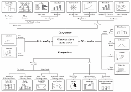
I categorized the selected widgets into five basic chart types:
-
Comparison
-
Composition
-
Distribution
-
Evolution
-
Relationship

Comparison
Composition
Distribution
Evolution
Relationship
Classification of Chart types (Online Resource)

VISUAL DESIGN
The graph sketches on post-its served as a great communication tool and great reference points for creating the visual mockups.
I used contrast colors between opposing elements, emphasizing the differences among these features. Also factoring in accessibility for this dashboard, I used Colorbrewer colorbrewer2.org which is a great online tool for picking the appropriate colors.
Also used the Enlighted "Where" product style-guide lines, however, I had to add one smaller font size to the existing style-guide as the dashboard shows legends which look best when they are subtle.
Distribution of Assets


Asset Summary
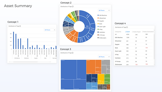

Concept 1 - STATIC

< Not scrollable
< Focused on the detailed analysis of the status at various levels
< Breadcrumb of location helps enable changing the building/floor
< Each widget can be maximized
< By default shows 10 categories, users can change these categories.
< Dashboard will show a maximum of 10 categories and a
minimum of 1 category
Concept 2 - MAP
Scrollable Dashboard >
Displays a geomap for reference >
Displays buildings with their total asset count >
Displays different key statues as Key Performance Indicators (KPIs) >
Maximum insights on 10 categories; can be changed
with a minimum of 1 category required

Concept 3 - SCROLL

Count
< Scrollable dashboard
< Larger sizes for the widgets that helps show bigger infographics (no maximize control)
< Geomap shows summary for the selected building
< New widget introduced here helps users see the asset count per room type over time

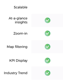
A dashboard is most effective when it gives the user key-action items, which was delivered in the final version of the dashboard. For the future iteration, we can also go one step ahead, and use AI to give users predictable insights for their actions.

Where Dashboard
Persona: Jane (Inventory Manager at a Hospital)


Jane can see asset utilization trends over any time period with this widget; she can use this information to proactively manage inventory, thereby reducing costs and optimizing efficiency.

Jane can quickly at-a-glace identify the quantities of wheelchairs located on the floor from this heatmap.
Now Jane can find the closest location to get a specified number of wheelchairs.

Jane can determine category status on a floor-by-floor basis.
With this information, she can more effectively project plan required timeline, crew members, and supplies to fix and sanitize relevant assets.
VIEW OTHER PROJECTS

