

Where App
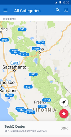
Where app enables users to locate real-time asset details through organizational and indoor maps.
Platform: iOS, Android
Team: 1 Project Manager, 3 UI Developers, 2 Backend Engineers, and a Designer.
Role: Lead Designer
I am responsible for all aspects of interaction and visual design.


RESEARCH
We analyzed the existing web application to see what was working and not working. We outlined key guidelines and constraints for the mobile application. The goal was to create an easy-to-use web app that delivers real-time location. Users should be able to view inventory from the mobile app (a common use case), but the management of inventory (infrequent use case) would only be available from the web application. Constraints that we had to work within included limited time and resources given a strict launch date for the mobile app.
We defined a three-step process for the design:
-
Analyze the existing web application of Where. Prioritize relevant features for the mobile app. This helped establish important content building blocks.
-
Organize content by the level of importance per screen.
-
Adhere to design principles. Assess and refine designs to ensure each screen aligns with the design principles. I outlined these core design principles based on business goals and IoT best practices

Design Principles
1
Less is more. Keep concise
2
Make the complex beautifully clear
3
Consider constraints
TASK FLOW
Below is the navigation flow of the app:

WIREFRAME
Explored various concepts working closely with Product Management. Analyzed pros and cons for each concept, and finalized on the ones that were the best balance between user goals and business goals.
Below is the exploration of the Live screen
Concept 1: Tab bar with segmented control
Concept 2: Minimal tab bar with list button
Concept 3 (Finalized): No tab bar, hamburger menu with segmented button
Research shows hamburger menus are generally not favored by users since all options are not visible in one glance. Despite this, hamburger menu best met the requirements for this app given the primary focus is the Live screen and items on the menu are viewed infrequently.
Once the sketches were finalized, I converted them to digital wireframes for initial user testing.

Live
Building List View
Tags List
Tag Detail
Bookmark


User Test Feedback

VISUAL DESIGN
Established an Enlighted style guide for mobile applications. Referenced several guidelines including the Enlighted Design Style Guide, iOS Human Interface Guidelines, Styling Wizard: Google Maps APIs and Material Design Guidelines .
Enlighted Design Style Guide


iOS Design Style Guide
Material Design Guide


WHERE APP STYLE GUIDE

High-Fi screens: While designing for the high-fi screens for the app, I took the previous learnings from user testing and the mobile style guide into account. As a team, we were all aligned that the screen designs for iOS and Android will be native to each platform. I used pre-existing UI kits to be aligned with the principles for iOS and Android.
Iteration 1

Iteration 2

Live-Floor View
Iteration 1

Iteration 2

Quick Access
Iteration 1

Iteration 2
Live-Building View
Iteration 1

Iteration 2

Tags List


APP FLOW CHART

KEY LEARNINGS
Design guidelines help meet user expectations:
Native templates provide a solid foundation for designing the app. Users are used to certain components within their smartphones and also familiar with certain functionality. Guidelines help to maintain device-specific expectations of the user. It also helps design more efficiently.
Teamwork and feedback make a product great:
Interacting with the broader team at key phases of the design were instrumental in improving the product. Early sketches helped me validate or discredit ideas early which helped to avoid wasted effort later. Furthermore, vetting the early sketches with the broader set of product and development stakeholders provided something tangible to provide input on and also helped them anticipate what was coming. Furthermore, it helped to establish project timelines and tasks early on.
Sketch Plugins and Symbols improve workflow and productivity:

I used plugins regularly throughout the design process to work effectively. The image on the left shows the key plugins I used. The plugins helped me to do tasks like create PDFs of the designs in two-three clicks, create comprehensive flows within a few mintues, and access Sketch material design components quickly.
VIEW OTHER PROJECTS

