top of page


AWS Navigation
The AWS navigation bar (also known as the global header) is used by millions of AWS users everyday to navigate to desired page on AWS Console.
PLATFORM: Web, Tablet, Mobile
TEAM: 1 Designer, 1 Senior Product Manager, 2 Front-End UI Developers, 5 Backend Engineers, 1 Dev Manager, 1 Design Manager, 1 UX Writer
ROLE: Design Lead
I was responsible for the overall design and its process. I collaborated with my team and various stakeholders. Presented the design direction to leadership at various stages.


RESEARCH
Research
I identified and documented key findings about the existing navigation bar including themes on customer asks and what was working well.
Scale favorited services
Scale recently visited
More context in region dropdown
More context in account dropdown
Mobile friendly
Colorful icons

Customer Asks
Also studied the click-data across the different navigation points, that further helped inform the product direction and also make design decisions.
Also looked into other AWS destinations to see if they had similar content and how was that positioned so that we could present consistent experiences to the AWS customers.

Different AWS Destinations
Defined the goals prior to design phase along with the Product Manager after research.

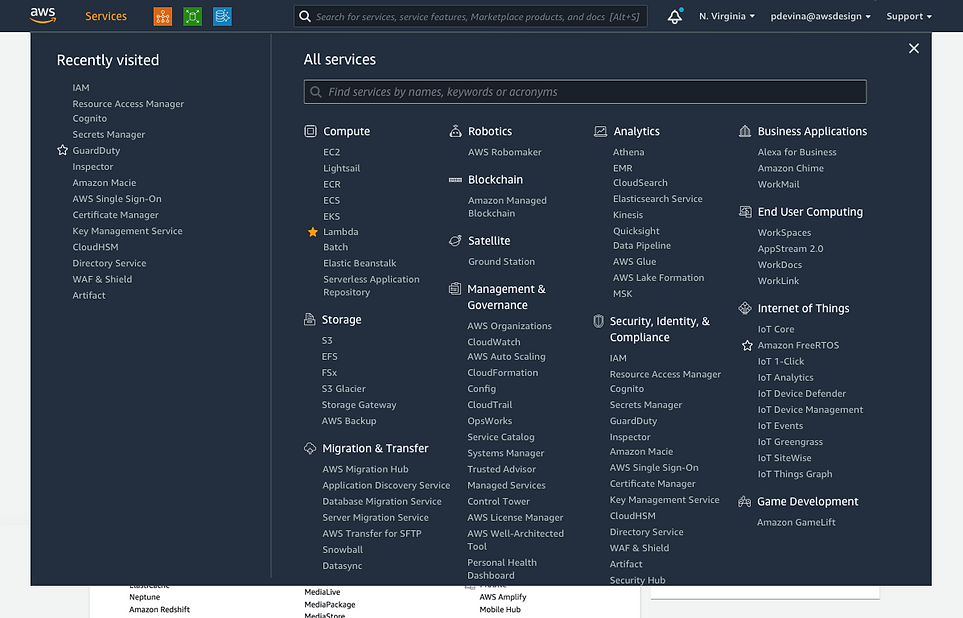
Previous experience for 'Services' dropdown
Goals defined
Favoriting
-
Increase discoverability
-
Improve scalability
-
Simplify
Visual Design
-
Responsive
-
Update to the new design system
-
Accessible
Other
-
Release space for new feature add-ons
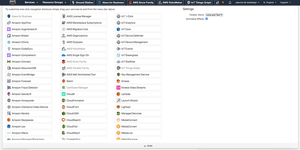
Previous experience for 'Favoriting' services dropdown
Info Archi
INFORMATION ARCHITECTURE
After defining the goals of the project, I created the Info Architecture diagram to better understand the flow of the various different sections within the Navigation bar. By referring to the insights from our research, I created a new flow for the sections on the Navigation bar. I presented this flow to the engineering and product leads to get their perspectives and made revisions based on our discussions.
Secondary level


Primary level
Secondary level
From the previous IA to the new proposed IA
Interaction Design
UX DESIGN
In parallel, also started working with the AWS Marketing team to get the new icons used by them so that we could also introduce it within the AWS Console Experience. I also spearheaded getting this design contribution into the AWS Design System so it could be used across 150+ services. This will help create a consistent experience for AWS customers across the different platforms and build strong service identity.

Previous icon system - Used a combination of line icons, 3-d icons,
and solid icons
New icon system introduced - All icons are now line with gradient background
Design Contribution to the AWS Design System
Focused on investigating key break-points that were defined in the design system and were being used across different AWS services. Used the four breakpoints - Desktop HD, Desktop, Tablet, Mobile for the responsive designs of the Navigation. Worked along with another designer who led 'Search' feature for Navigation. The first focus was on 'Desktop' view for getting alignment from leadership and stakeholders which was then scaled to be responsive.

Explorations for the dropdown menu
During these explorations, I used the AWS design system for icons, color palette, and typography. However, the design system did not include components for Navigational/Global header dropdowns and also for onboarding announcements. So I designed the global header dropdowns and defined their behaviors. Also introduced the first-ever onboarding announcement card that was then used extensively for all the new changes in the global header.
Concept 1
Concept 2

Exploration 3 (Proposed)

Simplify Favoriting
Improve Favoriting Discoverability
Update Visual Style to the New Design system
Design Accessible
Release Real Estate for Active Search
Design Responsive
Concept 3 (Proposed)
Achieved all the initial goals defined
Simplified Favoriting
Improved Favoriting Discoverability
Updated to the Visual Style of the New Design system
Designed to be accessible with keyboard functionality
Released Real Estate for Active Search
Designed to be Responsive


Screenshot of Usability study findings
As there were new components designed to support this feature, during handoff to the development team, I also created specification sheets that helped them deliver a demo that was close to pixel-perfection. Worked with the developers to address all their questions around implementation and also provided timely feedback as we all progressed closer to launch.

Navigational Onboarding Component Specification Details
Prototype
After 9 years, AWS released this new experience for the navigation bar/ global header. I wanted to learn from the customer feedback for the new experience launched so I started tracking feedbacks coming in from various sources - Reddit, Twitter and internal tools.


Screenshot of the spreadsheet I maintained for tracking in coming feedback from various platforms
LAUNCH QUOTES FROM CUSTOMERS


" We did it, discoverability of favoriting a service increased by 55% post launch"
- AWS Product Manager
POST LAUNCH RESULTS
1. Discoverability of favoriting a service increased by 55% post launch
2. Mobile Usage went up by 25% post launch
3. Released real-estate for 5 features that can be available on Navigation bar with one-click action
LEARNING
My biggest learning from this project was avoid increasing the number of click to access key actions for users.
In the design presented above in order to bring all the contextual elements together, it became a 2 click action for users to access their favorited service. User feedback post launch showed they would have liked to continue the one-click access to their favorited service. Post launch this became our biggest goal for the next iteration.
Next Iteration that was launched:

bottom of page